Chart Styles
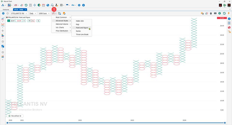
The MarvelChart Chart can be drawn and set with a set of different styles, each with its own distinctive characteristics. It is possible to change the style of a Chart using the appropriate button in the Command Bar 1. The styles are grouped by categories:
Most Common
Advanced Styles
Historical Volume
Vol. Charts
Price Distribution
Candles
This type of chart is also commonly called Candlestick or Japanese candles. They were first used in Japan in the 18th century to predict the price of rice. At that time, there were already futures contracts that were intended to unite the needs of producers with traders. The inventor, Munehisa Homma, earned a fortune thanks to this method and used war terms used in battle to provide terms for technical representations. The method arrived in Europe in 1989 thanks to Steve Nison who published various rules in his famous book Japanese Candlestick Charting Techniques. Today it is the most used graphic display method by traders.
Source: Wikipedia
Settings
Up Candle Color: color to draw the Real-Body of rising candles;
Down Candle Color: color to draw the Real-Body of falling candles;
Body Up/Down Mode: mode with which to calculate the direction of the candle, whether Up or Down. The available alternatives are
Open / Close - Calculates the Up/Down direction of the candle using the Open and Close prices of the candle itself;
Prev. Close / Close - Calculates the Up/Down direction of the candle using the Close prices of the previous and current candle;
Draw with Outlines: if active, the Real-Body of candles is drawn with a colored border;
Up Candle Outline Color: rising candles border color;
Down Candle Outline Color: falling candles border color;
Outline Up/Down Mode: Mode with which to calculate the direction of the candle for drawing outlines, whether Up or Down. See Body Up/Down for the list of available alternatives.
OHLC Bars
This type of chart is widely used to illustrate price movements over time, and takes its name from the prices that make up each bar of the chart: Open, High, Low and Close.
Source: Wikipedia
Settings
Up Color: color to draw rising bars;
Down Color: color to draw falling bars;
Body Up/Down Mode: mode with which to calculate the direction of the candle, whether Up or Down. The available alternatives are
Open / Close - Calculates the Up/Down direction of the candle using the Open and Close prices of the candle itself;
Prev. Close / Close - Calculates the Up/Down direction of the candle using the Close prices of the previous and current candle.
Line On Close
This is the simplest type of chart, and consists of a simple line that connects the various closing prices of the periods displayed in the chart.
Settings
Drawing Style: allows you to choose the mode in which to draw the chart line. The available choices are:
Simple Line: simple line, the value of “Line Color” will be used as the color of the line;
Open - Close: for each segment of the line, the color will be chosen between “Up Color” and “Down Color”, depending on the relationship between the Open and Close prices of the segment itself. If Close is greater than Open, the segment will be drawn with “Up Color”, instead if Close is less than Open, the segment will be drawn with “Down Color”;
Prev. Close - Close: for each segment of the line, the color will be chosen between “Up Color” and “Down Color”, depending on the relationship between the Close prices of the current segment and the Close of the previous segment. If the current Close is greater than the previous Close, the segment will be drawn with “Up Color”, instead if the current Close is less than the previous Close, the segment will be drawn with “Down Color”;
Line Color: color of the line when “Drawing Mode” is set to “Simple Line”;
Up Color: color of the ascending segments of the line when “Drawing Mode” is set to “Open - Close” or “Prev. Close - Close”;
Down Color: color of the descending segments of the line when “Drawing Mode” is set to “Open – Close” or “Prev. Close - Close”;
Line Width: thickness of the line;
Line Style: line style;
Area
This type of chart is very similar to Line On Close, with the difference that the area between the line that connects the prices and the base of the chart panel is colored with a different color or transparency.
Settings
Line Color: color to draw the line that connects the Close prices of the various periods;
Line Width: thickness of the line;
Line Style: line style;
Area Color and Transparency: color to fill the area between the line and the base of the chart panel and its transparency;
Heikin Ashi
Heikin Ashi candles (in Japanese: 平均足, average bar) are a variant of Candlestick calculated by applying a weighted average to the values under examination. The formulas are as follows:
Close = (real open + real high + real low + real close) / 4
Open = (previous Heikin-Ashi open + previous Heikin-Ashi close) / 2
High = max(real high, Heikin-Ashi open, Heikin-Ashi close)
Low = min(real low, Heikin-Ashi open, Heikin-Ashi close)
The synchronization of the body with the real Open and Close price is lost, so they are not reliable for direct valuation. The effect is more pronounced on the shadows, which are more prominent than regular candles. They are usually used as a complement to traditional charts. Heikin-Ashi charts resemble candlestick charts, but have a smoother appearance because they plot a range of price movements, rather than plotting every price movement as with candlestick charts. These charts are used by traders and investors to help determine and predict price movements. Like standard candlesticks, a Heikin-Ashi candle has a body and a line, however, they do not serve the same purpose as a candlestick chart. The last price of a Heikin-Ashi candle is calculated from the average price of the current bar or time period (for example, a daily time period would have each bar represent the price movements of that specific day). The main purpose of a Heikin-Ashi chart is to show the overall price action (price direction) and the strength of any trend; these are represented by the shadows, which are the lines that extend from the main body of the candle. A series of rising candles without lower shadows indicates a strong upward trend and vice versa with falling candles without upper shadows.
Source: Wikipedia
Settings
Up Candle Color: color to draw the Real-Body of rising candles, i.e. candles whose Close price is higher than the Open price;
Down Candle Color: color to draw the Real-Body of falling candles, i.e. candles whose Close price is lower than the Open price;
Shadow Color: color to draw the lower and upper shadows of the candles;
Draw with Outlines: if active, the Real-Body of the candles is drawn with a colored border;
Up Candle Outline Color: Color of the border of rising candles;
Down Candle Outline Color: Color of the border of falling candles;
Kagi
The Kagi chart is used to monitor price changes, and differs from traditional charts such as Candlesticks and OHLC in that the Kagi is almost completely independent of time. This feature helps produce a chart design that reduces “background noise”.
Source: Wikipedia
Settings
Price Source: choice of which price to use in the chart calculation, between Close and OHLC average price;
Size Mode: choice of which method to use to calculate the price deviations that determine changes in the trend. The available choices are:
Points: number of points or value in price, settable in the “Points” parameter;
Percent: percentage value compared to the previous price, settable in the “Percent” parameter;
ATR: Average True Range, which allows you to have a chart setting that is always valid because it is self-adaptive. It is possible to set the number of periods with which to calculate the Average True Range in the “ATR Periods” parameter;
Points: if “Size Mode” is set to “Points”, number of points or price value that determines a trend change;
Percent: if “Size Mode” is set to “Percent”, percentage value compared to the previous price that determines a trend change;
ATR Periods: if “Size Mode” is set to “ATR”, number of periods with which to calculate the Average True Range, whose value represents the minimum range of price movement that determines a trend change;
Up Color: color with which to draw the segments that represent an upward trend;
Down Color: color with which to draw the segments that represent a downward trend;
Point and Figure
Point and Figure charts do not plot the chart as price versus time, like Candlestick charts do. Point and Figure charts plot the price versus its direction changes, plotting a column of Xs when the price goes up and a column of O's when the price goes down.
Source: Wikipedia
Settings
Price Source: choose which price to use in the chart calculation, between Close and average price between High and Low;
Size Mode: choose which method to use to calculate the price deviations that determine changes in the trend. The available choices are:
Points: number of points or price value, settable in the “Points” parameter;
Percent: percentage value compared to the previous price, settable in the “Percent” parameter;
ATR: Average True Range, which allows you to always have a valid chart setting because it is self-adaptive. It is possible to set the number of periods with which to calculate the Average True Range in the “ATR Periods” parameter;
Points: if “Size Mode” is set to “Points”, number of points or price value that determines a change in the trend;
Percent: if “Size Mode” is set to “Percent”, percentage value compared to the previous price that determines a change in the trend;
ATR Periods: if “Size Mode” is set to “ATR”, the number of periods with which to calculate the Average True Range, whose value represents the minimum range of price movement that determines a change in the trend;
Reversal Size: the minimum number of “blocks” to be reached to identify a trend reversal;
Up Color: the color with which to draw the Xs that represent an upward trend;
Down Color: the color with which to draw the Os that represent a downward trend;
Renko
A Renko chart (Japanese: 練行足, romanized: renkōashi, also written 練り足, neriashi) is a type of financial chart of Japanese origin used in technical analysis that measures and plots price changes. A Renko chart consists of blocks (煉瓦, renga, or bricks in English), which proponents claim clearly show different market trends and increase the signal-to-noise ratio compared to a typical Candlestick chart.
Source: Wikipedia
Settings
Price Source: choice of which price to use in the chart calculation, between Close and OHLC average price;
Size Mode: choice of which method to use to calculate the price deviations that determine changes in the trend. The available choices are:
Points: number of points or price value, settable in the “Points” parameter;
Percent: percentage value compared to the previous price, settable in the “Percent” parameter;
ATR: Average True Range, which allows you to have a chart setting that is always valid because it is self-adaptive. It is possible to set the number of periods with which to calculate the Average True Range in the “ATR Periods” parameter;
Points: if “Size Mode” is set to “Points”, number of points or price value that determines a change in the trend;
Percent: if “Size Mode” is set to “Percent”, percentage value compared to the previous price that determines a change in the trend;
ATR Periods: if “Size Mode” is set to “ATR”, number of periods with which to calculate the Average True Range, whose value represents the minimum range of price movement that determines a change in the trend;
Up Color: color with which to draw the segments that represent an upward trend;
Down Color: color with which to draw the segments that represent a downward trend;
Three-Line Break
The Three Line Break chart has a particular construction: green or red columns are drawn on the chart depending on the directionality and the formation of new highs or new lows of the stock. The only price taken into consideration is the closing price, if the closing is higher than the previous high a new green column will be generated, if it is lower than the previous low a new red column will be generated, nothing will be done if there are no new highs or new lows.
Source: Traderpedia
Settings
Num. Lines: minimum number of "lines" to identify a trend reversal;
Up Color: color to draw the blocks that identify an upward trend;
Down Color: color to draw the blocks that identify a downward trend;
Border Color: color to draw the edges of the blocks;
Candles Volume
The Candle Volume chart is a sort of hybrid between the Equi-Volume Arms chart and the Candlestick chart. To be traced, it requires the opening, closing, minimum, maximum and trading volume data. It has all the characteristics of the classic Candlestick chart with the particularity of being able to inflate in direct relation to the trading volume; the more interest there is in the title (in the form of trades) the wider the real body of the Candles Volume chart will be.
Source: Traderpedia
Settings
Up Candle Color: color to draw the Real-Body of rising candles;
Down Candle Color: color to draw the Real-Body of falling candles;
Shadow Color: color to draw the lower and upper shadows of candles;
Body Up/Down Mode: mode with which to calculate the direction of the candle, whether Up or Down. The available alternatives are
Open / Close - Calculates the Up/Down direction of the candle using the Open and Close prices of the candle itself;
Prev. Close / Close - Calculates the Up/Down direction of the candle using the Close prices of the previous and current candle;
Draw with Outlines: if active, the Real-Body of candles is drawn with a colored border;
Up Candle Outline Color: rising candles border color;
Down Candle Outline Color: falling candles border color;
Outline Up/Down Mode: Mode with which to calculate the direction of the candle for drawing outlines, whether Up or Down. See Body Up/Down for the list of available alternatives.
Equi-Volume
The Equi-Volume analysis links together the sources of information of the price range and the traded volume in order to highlight the market situations. The graphic construction of the Equi-Volume chart is very particular, the volume data is moved from the base of the chart (where they are found in the bar chart) to be included in the price representation.
Source: Traderpedia
Settings
Up Candle Color: color to draw the Real-Body of rising candles;
Down Candle Color: color to draw the Real-Body of falling candles;
Body Up/Down Mode: mode with which to calculate the direction of the candle, whether Up or Down. The available alternatives are
Open / Close - Calculates the Up/Down direction of the candle using the Open and Close prices of the candle itself;
Prev. Close / Close - Calculates the Up/Down direction of the candle using the Close prices of the previous and current candle;
Draw with Outlines: if active, the Real-Body of the candles is drawn with a colored border;
Up Candle Outline Color: rising candles border color;
Down Candle Outline Color: falling candles border color;
Outline Up/Down Mode: Mode with which to calculate the direction of the candle for drawing outlines, whether Up or Down. See Body Up/Down for the list of available alternatives.
Equi-Volume Shadow
It is a type of chart derived from Equi-Volume, but introduces the drawing of the closing price, in order to determine for each bar the presence or absence of a shadow. For candles with a Close price higher than the Open price, the upper shadow will be highlighted, while for candles with a Close price lower than the Open price, the lower shadow will be highlighted. The shadows are represented by “empty” areas inside the candles. The more the candles are “full”, the stronger the trend.
Settings
Up Candle Color: color to draw the Real-Body of rising candles;
Down Candle Color: color to draw the Real-Body of falling candles;
Body Up/Down Mode: mode with which to calculate the direction of the candle, whether Up or Down. The available alternatives are
Open / Close - Calculates the Up/Down direction of the candle using the Open and Close prices of the candle itself;
Prev. Close / Close - Calculates the Up/Down direction of the candle using the Close prices of the previous and current candle;
Draw with Outlines: if active, the Real-Body of the candles is drawn with a colored border;
Up Candle Outline Color: rising candles border color;
Down Candle Outline Color: falling candles border color;
Outline Up/Down Mode: Mode with which to calculate the direction of the candle for drawing outlines, whether Up or Down. See Body Up/Down for the list of available alternatives.
Footprint
Footprint is the footprint that volumes give to the market. By analyzing the actions of buyers and sellers, the trader can identify a direction of the market. Keep in mind that volume analysis is a fairly recent method for viewing asset charts, in fact, it was introduced only 20 years ago and is the only real indicator that has a delay in calculation equal to zero.
Settings
The Footprint chart can be configured in 900 different combinations, so it can be adapted to the needs of any trader.
The Footprint chart style, given the numerous combinations of settings available, has 5 pre-configured templates:
Basic - displays the purchase and sale volumes with the same color using transparency, more opacity means higher volumes, more transparency indicates lower volumes;
Buy/Sell - displays the purchase and sale volumes with two different colors using transparency, more opacity means higher volumes, more transparency indicates lower volumes;
Buy/Sell Bar Width - displays the purchase and sale volumes with two different colors using the length of the bars to represent the volumes, longer bars indicate higher volumes, shorter bars indicate lower volumes;
Advanced - like Buy/Sell, but also shows the Delta, i.e. the difference between the buy and sell volumes, at the top of the candles, and the total volume at the bottom of the candles, both displayed as simple texts;
Advanced Bar Width - like Buy/Sell Bar Width, but also shows the Delta, i.e. the difference between the buy and sell volumes, at the top of the candles, and the total volume at the bottom of the candles, both displayed as simple texts.
TimeFrame: configure the TimeFrame of the historical data to be used in the Chart. The recommended timeFrame is Ticks/Range at 10 ticks.
By clicking on one of these choices, the chart will be set as shown in the relative previews. The last button allows you to access the custom configuration of the chart.
When you choose to customize the appearance of the Footprint style, the detailed settings tab will be displayed, which has the following items:
Draw On Top: choice of which value to display above each candle in the chart;
Draw on Bottom: choose which value to display under each candle in the chart;
Draw on Left Side: define the candle left side drawing item;
Draw on Right Side: define the candle right side drawing item;
The 2 settings “Draw On Top” and “Draw On Bottom” concern the overall values of the candle, including all the different price levels, and are always displayed as plain text. The available choices are:
None: does not display any value;
Buy-Sell Volumes: difference between the purchase and sale volumes, displayed as “Delta”;
Delta %: difference between the purchase and sale volumes, expressed as a percentage of the total volume;
Total Buy Volume: purchase volumes of the candle;
Total Sell Volume: sale volumes of the candle;
Total Trades: total number of trades executed in the candle;
Total Volume: sum of candle buy and sell volumes;
The “Draw on Left Side” and “Draw on Right Side” settings concern the characteristics of each individual price level of the candle, and each has the following parameters:
Item: choice of which parameter to draw;
Style: choice of style to draw with;
Color: color to draw with;
For the “Item” setting, the available choices are:
None: does not draw any value;
Buy Trades: number of buy trades;
Buy Volume: buy volumes;
Buy Volume %: buy volumes, expressed as a % compared to the candle sum of buy and sell volumes for each price level;
Buy-Sell Vol. %: difference between the buy and sell volumes, expressed as a % compared to the sum of the buy and sell volumes of the individual price level of the candle;
Buy-Sell Volumes: difference between the candle buy and sell volumes for each price level;
Sell Trades: number of sell trades;
Sell Volume: sales volumes;
Sell Volume %: sales volumes, expressed as a % of the sum of the buy and sell volumes of the single price level of the candle;
Total Trades: number of buy and sell trades;
Total Volume: sum of the buy and sell volumes;
For the “Style” setting, the available choices are:
Bar Width: variable bar width, the higher the values to be displayed, the wider the displayed bar will be;
Delta Colored Bar Width: variable bar width, the higher the values to be displayed, the wider the displayed bar will be. Furthermore, the Delta, i.e. the difference between the purchase and sale volumes, determines the color, red or green, with which to draw the bar;
Delta Colored Transparency: constant bar width. The Delta, i.e. the difference between the purchase and sale volumes, determines the color, red or green, and the transparency with which to draw the bar;
Text Only: draws only the text;
Transparency: constant bar width, the higher the values to be displayed, the more opaque the bar will be;
In the lower section of the window there are the settings for drawing the actual candles.
Up Color: color to draw the Real-Body of rising candles;
Down Color: color to draw the Real-Body of falling candles;
Body Up/Down Mode: mode to calculate the direction of the candle, whether Up or Down. The available alternatives are
Open / Close - Calculate the Up/Down direction of the candle using the Open and Close prices of the candle itself;
Prev. Close / Close - Calculate the Up/Down direction of the candle using the Close prices of the previous and current candle;
Draw with Outlines: if active, the Real-Body of the candles is drawn with a colored border;
Outline Up Color: rising candles border color;
Outline Down Color: falling candles border color;
Outline Up/Down Mode: mode to calculate the direction of the candle for drawing the outlines, whether Up or Down. See Body Up/Down for a list of available alternatives.
Imbalance
The Imbalance chart is similar to the Footprint chart: it also uses trading volumes to display Imbalance situations, i.e. the lack of balance between buyers' and sellers' volumes. Let's see how the trader can manage this phenomenon that is often perceived as a good new trading opportunity, so here's how it is calculated.
Preview | Meaning |
---|---|
The algorithm shows the volume traded by bid and ask at certain price levels for each bar on the chart, compares bid and ask diagonally (in both directions) and highlights in light blue a significant excess of one over the other. The bar in the image alongside shows how sellers entered the market unbalanced compared to buyers and pushed the price down. |
Preview | Meaning |
---|---|
In the image on the side, the algorithm marks the first box in light blue because the current setting is: volumes with a major difference > 200% comparing Bid and Ask in two different adjacent price levels. The calculation is performed in both directions, i.e. volume 2 with volume 25 (2/25=0.4*100=40%) and volume 25 with volume 2 (1250%). Since in the box shown, volume 25 has a result greater than 200% (our minimum activation level with the current settings), it is highlighted in light blue. Here is a first Imbalance! |
Preview | Meaning |
---|---|
The same procedure was performed for box 281 and box 1. In fact 281/1 100 = (281%) while 1/281100 = (0.3%). And since we have set to highlight imbalances greater than 200%, box 281 is colored blue. This is the second Imbalance, which however is not a support/resistance level as we have set by default to consider support/resistance only in the case of 3 adjacent Imbalances in 1 single bar. |
In the image above you can see how after 3 Imbalances in the same bar the light blue Support line 1 has been drawn. In fact the price takes the path of the climb. Then, in the bar relative to the point 2 another 3 Imbalances have occurred thus drawing a Resistance.
Settings
Imbalance Ratio: the percentage you want to intercept by comparing the Bid and Ask volumes in two different adjacent price levels;
Ticks Grouping: the number of ticks that make up a price level in the candles;
Show Support/Resistence: activate to display support and resistance zones;
S/R Imbalance Count*: how many adjacent Imbalances must there be before drawing a support or resistance;
S/R Length: allows you to choose how to display the support/resistance line in one of three modes:
Chart End: the S/R line will be drawn up to the right edge of the chart, and will always be present even if new S/R lines are generated;
Next S/R: this choice allows you to display the S/R line only until a new S/R line is generated;
Fixed number of Bars: each S/R line has the same length, which can be changed by setting the value in the “S/R Length in Bars” field;
Sell Color*: the color of the column with the volumes traded on Bid;
Buy Color*: the color of the column with the volumes traded on Ask;
Imbalance Color: color to highlight Imbalance conditions and draw support and resistance zones;
Heatmap
The Heatmap chart highlights the price levels where more volumes are first placed and then traded and which define, in real time, without delays therefore, which are Supports or Resistances. This chart is used in electronics, in medicine, in all fields where it is useful to verify "habits", and is commonly called Heatmap (heat map). We will use it for trading.
Elements that make up a Heatmap chart
A Heatmap chart is composed of several elements:
Best Bid and Best Ask price lines
For each period represented in the Heatmap chart, two horizontal lines are drawn, which represent the Best Bid and Best Ask prices present on the DOM levels at the close of the historical bar. The lines have two distinct colors, green for the Best Ask line, and red for the Best Bid line. The colors identify the fact that at the Best Ask level purchases can take place (green color), while at the Best Bid level sales can take place (red color).
Pending volumes on the DOM levels
Pending volumes on the DOM levels are represented in the Heatmap chart as colored rectangular blocks. The color of the pending volumes on the DOM varies from orange, to blue, and finally to light blue to indicate the points where there were more pending orders: light colors indicate little volume, intense orange colors indicate a lot of volume.
Volume Bubbles
Volume Bubbles are "bubbles" that represent the volumes actually traded in a given period: a green bubble indicates that there have been more buying than selling trades, a red bubble indicates that there have been more selling trades than buying. The size of the Volume Bubbles represents in absolute value the difference in quantity between the buying and selling volumes traded in a given period on the chart.
Bid/Ask Volume Profile
The Bid/Ask Volume Profile is drawn as a series of histograms on the right side of the chart. For each price level, the following is drawn:
a histogram representing the selling volume, called Bid Volume, and colored in red;
a histogram representing the buying volume, called Ask Volume, and colored in green;
a histogram representing the difference between the Ask Volume and Bid Volume values, whose color will be green when the buying volumes are higher than the selling values, and red otherwise. This histogram is drawn using the zero value as the center, so negative values are drawn as histograms that extend from the center to the left, while positive values are drawn as histograms that extend from the center to the right.
Example of interpretation of a Heatmap chart
Preview | Meaning |
---|---|
In this image you can see that the price of the asset is heading towards a resistance defined by the color orange, which is even present on 3 consecutive levels of the DOM. The trader's choice is to go Long on the break of the resistance or Short in the event of a downward rebound. In this case, the volumes that are displayed with the histograms to the right of the graph also contain the phases preceding the attack that is about to take place, but in this phase it is important to observe only the trades that are taking place at this precise moment. Here it becomes useful to be able to reset the previous trades to have a clean view of the market. |
Preview | Meaning |
---|---|
Having reset the previous trades, it is easy to identify the fact that the attack on the resistance is taking place with great energy, and therefore it is possible to take a Long position. |
Settings
TimeFrame (Ticks): interval in Ticks of the TimeFrame to use for historical data;
Num. DOM Levels: number of DOM levels to request;
Best Bid Line Color: color of the line drawn at the Best Bid;
Best Ask Line Color: color of the line drawn at the Best Ask;
Best Bid/Ask Lines Width: thickness of the Best Bid and Best Ask lines;
Best Bid/Ask Lines Style: drawing style of the Best Bid and Best Ask lines;
Min. Regular Size Color: color for normal Sizes, used on minimum values;
Max. Regular Size Color: color for normal Sizes, used on maximum values;
Min. Significant Size Color: color for Size of significant size, used on minimum values;
Max. Significant Size Color: color for Size of significant size, used on maximum values;
Positive Volume Color: color used to draw the purchase volumes actually traded;
Negative Volume Color: color used to draw the sale volumes actually traded;
Volume Bubbles Transparency: transparency to apply to the Volume Bubbles on the chart;
Bid/Ask Volume Profile: Enables or disables the drawing of the Bid/Ask Volume Profile.
Market Profile
Market Profile is an intra-day charting technique (price vertical, time/activity horizontal) developed by J. Peter Steidlmayer, a trader at the Chicago Board of Trade (CBOT), from about 1959 to 1985. Steidlmayer was looking for a way to determine and evaluate the value of the market as it unfolded throughout the day. The idea was to display price on a vertical axis versus time on the horizontal, and the resulting chart is generally bell-shaped: widest at mid-prices, with decreasing activity and decreased volume at the highest and lowest extreme prices. In this structure, Steidlmayer recognized the “normal” Gaussian distribution he had been introduced to in college statistics.
The Market Profile offers the possibility of viewing the price levels and volumes traded for certain time intervals, thus obtaining information on the support or resistance levels that have been created. It will also be possible to evaluate when these levels were obtained and with how many trades, thus also evaluating a measure of "strength". The blocks or letters group the prices at which the trades take place in the time selected by the user. These blocks are called Time Price Opportunities which for convenience we call TPO. The distribution of prices during the day will contain all the TPOs obtained in the selected time frame. That is, the distribution graph will have a first block (TPO) with the letter "A" which will correspond to the first price traded. This first TPO will contain all the trades that took place in the selected price range and can be followed by other TPOs with the same letter or color until the time selected in the Settings expires. At the end of this time, new blocks identified by the following letter with a different color will be added to the graph, repeating the same construction until the market closes. In an 8-hour market, if we assume that we set the timeframe to 30 minutes, we will have a distribution of blocks or letters that will be respectively: (8 0h / 30 minutes = 16) 16 different colors for 16 letters of the alphabet (from A to P). To the right of the letters, a red asterisk and the symbol # appear to indicate the Last, which at the close of trading will correspond to the Close. It is possible to display labeled horizontal lines that correspond to:
POC: shows the longest traded price in the current distribution. The value shown is the average of all the prices that make up all the blocks corresponding to the longest line;
POC Vol: shows the price at which the greatest number of trades occurred, not to be confused with the greatest number of volumes. It favors 1000 trades of 1 share rather than 1 trade of 1000 shares.
You can also display colored vertical zones that correspond to:
Initial Balance: price deviation in the first two letters of the profile (the timeframe of the letters is settable);
Opening Range: price deviation in the first 5 minutes of trading (settable);
Value Area: area that represents 70% of the number of TPOs. 70% of the TPOs are calculated starting from the POC line;
Volume Value Area: area in which 70% of the TPOs of the volumes are concentrated, calculated starting from the POC Vol line;
Initial Balance Extension 1-2-3: you can select up to 3 different vertical zones that represent the Initial Balance increased, in number of letters, by the percentage selected by the user;
Custom Lines: allows you to draw lines at set prices and names.
Finally, you can display the Volume histograms to the left or right of the distribution of the TPOs of the prices. Volume histograms are also drawn in blocks, each TPO price block has its corresponding Volume block.
In the Market Profile there is an information panel that shows the characteristics of the TPO blocks where the mouse cursor is positioned. This panel is divided into several sections, separated from each other by an empty line.
First Section
TPO Date and Time;
TPO: Number of total TPO blocks in the profile, followed by the number of TPOs above the POC line and the number of TPOs below the POC line;
TFF: Trade Facilitation Factor, equal to the total number of TPOs divided by the High-Low price range of the profile. The higher the value, the weaker the trend. Profiles typically have high TFF values, and only trading days/weeks with very significant price changes have low TFF values;
Q%: Open and Close Quadrant. These values are calculated as Open/Range and Close/Range respectively. Range is the High-Low price range of the profile. Values can range from 0% (when Open or Close are equal to Low) to 100% (when Open or Close are equal to High);
VAH: Value Area High;
VAL: Value Area Low;
POC: Point of Control, which represents the most traded price in the profile, i.e. the line that contains the most blocks;
RF: Rotation Factor. For each letter in the profile, a value of +1 is calculated if its High is higher than the High of the previous letter, and a -1 if its High is lower than the High of the previous letter. In addition, a +1 is calculated if its Low is higher than the Low of the previous letter, and a -1 if its Low is lower than the Low of the previous letter. The value calculated for each letter, which can range from -2 to +2, is added to obtain the RF value of the profile;
VLT: Volatility, calculated as the average price range of the letters that make up the profile;
RNG: Price range of the profile, equal to High-Low, followed in brackets by two other values, which represent the height of the profile in blocks and the maximum width of the profile in blocks;
MID: Average price of the profile, equal to High+Low / 2;
VOL: Total volume of the profile.
Second section
P: Price of the TPO on which the mouse cursor is positioned;
V: Volume associated with the TPO.
Third section
TPO: Number of blocks/TPO at the price identified by the mouse position, followed in brackets by the number of TPO above the price and the number of TPO below the price.
Fourth section
LET: Letter, represents all the letters in the profile equal to the one identified by the mouse position. In addition to the letter, the initial Date and Time of the letter is also displayed, and then the range of minimum and maximum times represented by the letter itself;
H: Maximum price of the letter;
L: Minimum price of the letter;
V: Total volume of all TPOs associated with the letter;
RNG: Price range of the letter, equal to High-Low of the letter.
Fifth section
TPO: Letter and average price of the single TPO identified by the mouse position;
V: Volume associated with the single TPO.
Source: Wikipedia
Settings
View Tab
TimeFrame: data grouping, the available choices are Daily and Weekly, indicating that each profile represents a day or a week of trading;
TPO Block Size: size of the TPO blocks, the available choices are Automatic or Manual, indicating the price excursion of each TPO block of the profile. Choosing the Auto setting, the chart automatically calculates the excursion of the TPO blocks, while choosing Manual will require setting the excursion in the following field;
Custom TPO Block Size: represents the price excursion of each TPO block of the chart, available only when “TPO Block Size” is set to Manual;
Split TPO Blocks horizontally: if active, each column of the profile will contain only one letter, otherwise the letters in the profile will be positioned in the first free position on the left, making the profiles more similar to a Gaussian distribution;
POC: enables or disables the drawing of the POCs, and chooses their color;
Volume POC: enables or disables the drawing of the Volume POCs, and chooses their color;
Value Area: enables or disables the drawing of the Value Areas, and chooses their color;
Volume Value Area: enables or disables the drawing of the Volume Value Areas, and chooses their color;
Initial Balance: enables or disables the drawing of the Initial Balance, and chooses its color;
Opening Range: enables or disables the drawing of the Opening Range, and chooses its color;
Open Symbol: chooses the color to use to draw the block corresponding to the opening of the profile;
Close Symbol: chooses the color to use to draw the block corresponding to the profile closing;
Volume Position: allows you to choose where to display the TPOs related to the Volumes. The available choices are Left (draw to the left of the price profiles), Right (draw to the right of the price profiles) and Off (does not draw the TPOs of the volumes);
Informations Panel: enables or disables the drawing of the information panel related to the position of the mouse pointer.
General Tab
Minutes per Letter: indicates the duration of each letter of the profiles;
First Letter Time: indicates the duration of the first letter of the profiles;
First Letter: allows you to choose which sequence of letters to use to draw the profiles;
Color for All Letters/Blocks: if active, sets a single color to use for all the letters of the profiles, otherwise the profiles will have a different color for each letter;
Draw Blocks only: always and only draws blocks, without highlighting the relative letters within the blocks themselves;
Initial Balance Extension 1-2-3: activates or deactivates extension 1, 2, or 3 of the Initial Balance, and allows you to set the color and how many letters to add to the Initial Balance, expressed as a percentage (example: if Initial Balance includes the 2 letters A and B, setting 200% the extension will include the 4 letters A, B, C and D);
Show Extensions Labels: if active, shows texts for each of the extensions of the Initial Balance active on the chart;
Opening Range: duration of the Opening Range of the profiles.
Custom Lines Tab
In the last section of the settings window you can choose which custom lines to add to the chart and how to draw them. The lines can be added or removed using the grid at the top of the tab, while the way in which they are drawn can be customized in the lower part of the tab. The columns available in the grid are:
Enabled: determines whether the line is active or off;
Label: sets what text to show next to the line on the chart;
Price: sets at what price to draw the line;
The way in which to draw the custom lines on the chart includes the items:
Show Custom Lines: if active, enables the drawing of custom lines, if off no custom line will be drawn, even if present and active in the lines grid;
Show Custom Lines Labels: if on, enables the drawing of text for each custom line, if off no text will be drawn next to the custom lines;
Show Custom Lines Prices: if on, the price of each custom line will be shown next to it on the chart;
Custom Lines Color: chooses which color to use to draw the custom lines on the chart.