Heatmap
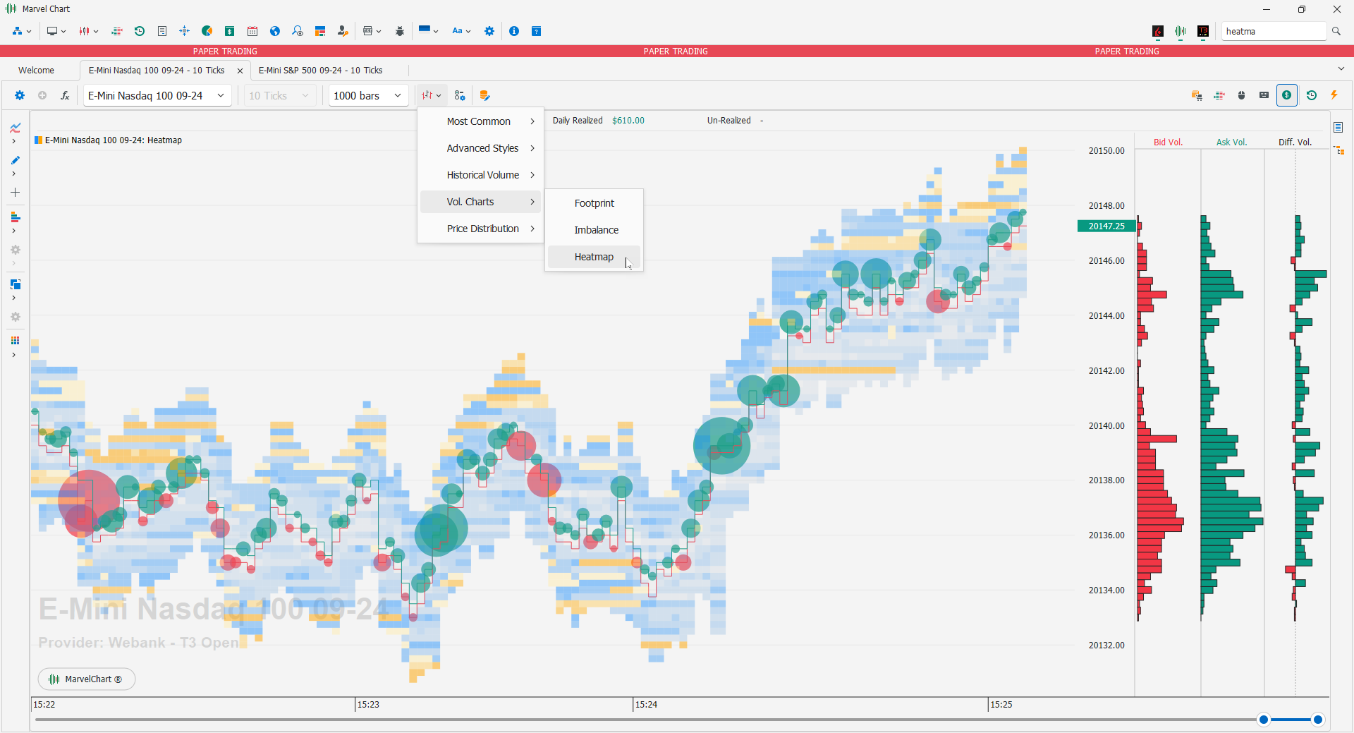
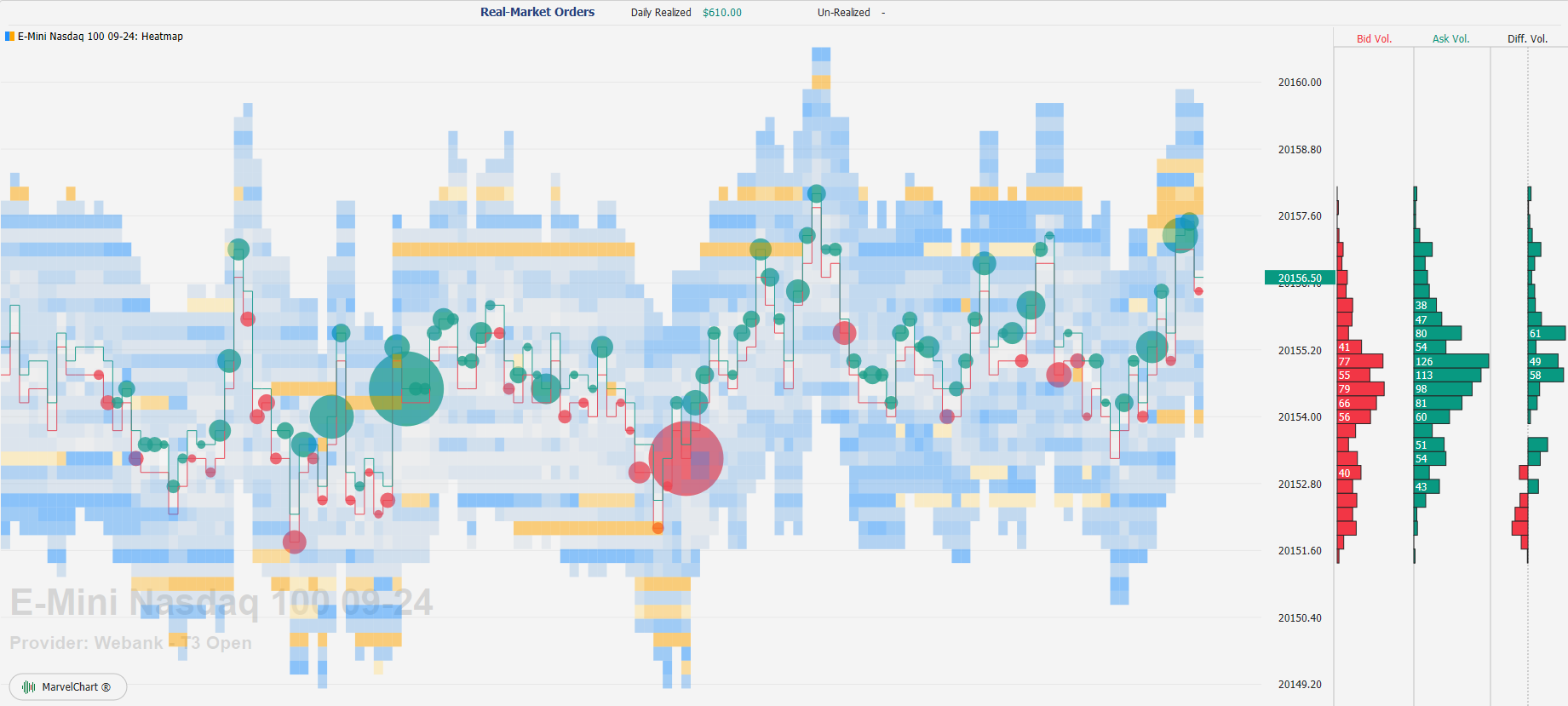
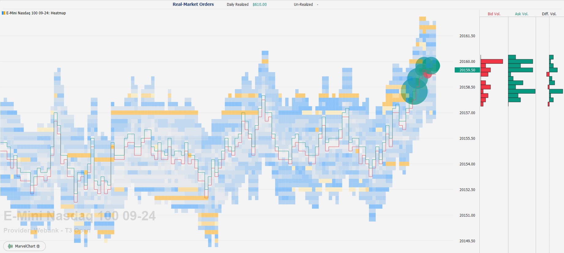
The Heatmap chart highlights the price levels where more volumes are first placed and then traded and which define, in real time, without delays therefore, which are Supports or Resistances. This chart is used in electronics, in medicine, in all fields where it is useful to verify "habits", and is commonly called Heatmap (heat map). We will use it for trading.
Elements that make up a Heatmap chart
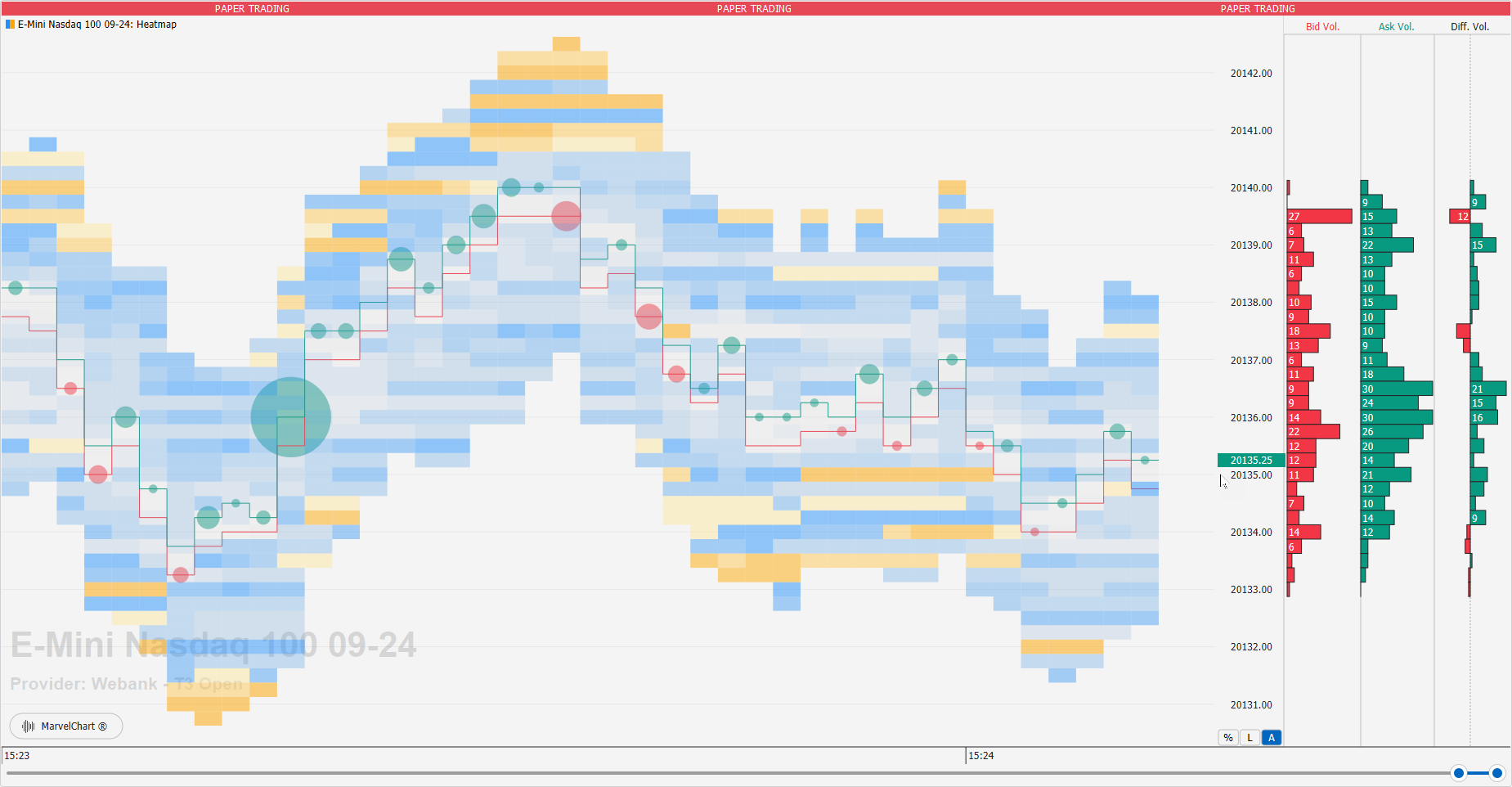
A Heatmap chart is composed of several elements:
Price lines
For each period represented in the Heatmap chart, horizontal lines can be drawn to represent price levels. The prices that can be drawn are:
Best Bid and Best Ask
They are represented by two horizontal lines, to display the Best Bid and Best Ask prices available on the DOM levels at the close of the historical bar. The lines have two distinct colors, green for the Best Ask line, and red for the Best Bid line. The colors identify the fact that at the Best Ask level purchases can take place (green color), while at the Best Bid level sales can take place (red color).
Last
It is represented by a single horizontal line, and displays the Last price filled at the close of the historical bar.
Volume Weighted Average Price
It is represented by a single horizontal line, and displays the volume weighted average price of all trades filled within the historical bar.
Pending volumes on the DOM levels
Pending volumes on the DOM levels are represented in the Heatmap chart as colored rectangular blocks. The color of the pending volumes on the DOM varies from orange, to blue, and finally to light blue to indicate the points where there were more pending orders: light colors indicate little volume, intense orange colors indicate a lot of volume.
Volume Bubbles
Volume Bubbles are "bubbles" that represent the volumes actually traded in a given period: a green bubble indicates that there have been more buying than selling trades, a red bubble indicates that there have been more selling trades than buying. The size of the Volume Bubbles represents in absolute value the difference in quantity between the buying and selling volumes traded in a given period on the chart.
Bid/Ask Volume Profile
The Bid/Ask Volume Profile is drawn as a series of histograms on the right side of the chart. For each price level, the following is drawn:
a histogram representing the selling volume, called Bid Volume, and colored in red;
a histogram representing the buying volume, called Ask Volume, and colored in green;
a histogram representing the difference between the Ask Volume and Bid Volume values, whose color will be green when the buying volumes are higher than the selling values, and red otherwise. This histogram is drawn using the zero value as the center, so negative values are drawn as histograms that extend from the center to the left, while positive values are drawn as histograms that extend from the center to the right.
Example of interpretation of a Heatmap chart
Settings
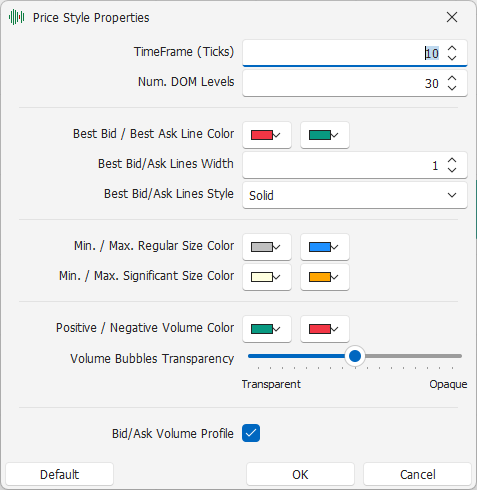
TimeFrame (Ticks): TimeFrame interval, in Ticks, to use for historical data;
Num. DOM Levels: number of DOM levels to request;
Draw Lines: type of price lines to draw. The available alternatives are:
None: does not draw any price lines;
Bid and Ask: draws 2 distinct lines to represent the Best Bid and Best Ask prices available on the DOM levels at the close of the historical bar;
Last: draws a single line to represent the Last price filled at the close of the historical bar;
Volume Weighted Average Price: draws a single line to represent the volume weighted average filled price of all trades filled within the historical bar;
Best Bid / Best Ask Line Color: colors of the lines drawn corresponding to the Best Bid and Best Ask respectively;
Last/VWAP Line Color: color of the line drawn corresponding to the Last and Volume Weighted Average Price prices;
Price Lines Width: thickness of the price lines;
Price Lines Style: drawing style of the price lines;
Palette: set of colors to use in drawing the volumes available on the DOM levels. The available choices are:
Default: basic colors, automatically adapted based on the use of MarvelChart with a light or dark color theme, with warmer shades representing larger volumes and colder shades representing smaller volumes;
Blues: colors with various shades of blue/light blue, more intense for higher volumes, more pale for smaller volumes;
Dark Rainbow: dark rainbow colors, with warmer shades representing larger volumes and colder shades representing smaller volumes;
Light Rainbow: light rainbow colors, with warmer shades representing larger volumes and colder shades representing smaller volumes.
Smoothing: allows you to set how much the volumes available on the DOM levels should be "rounded" using the contiguous values;
Positive / Negative Volume Color: colors used to draw the volumes actually traded, respectively in purchase and sale;
Volume Bubbles Transparency: transparency to apply to the Volume Bubbles on the chart;
Bid/Ask Volume Profile: Activates or deactivates the drawing of the Bid/Ask Volume Profile.
