X and Y Axis

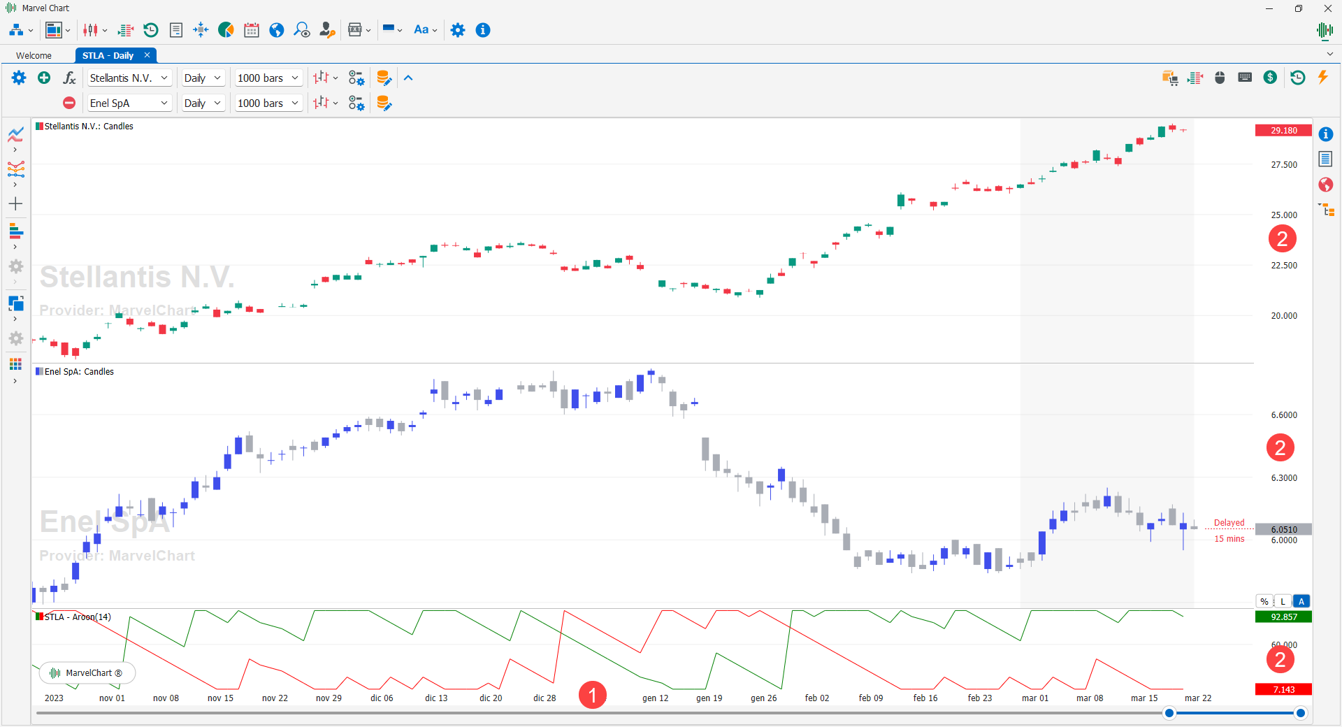
In the MarvelChart Charts, by using the mouse on the X 1 and Y 2 axes, you can modify various aspects relating to the design of the historical series and the indicators applied. For each Chart, there is a single X Axis, while by adding indicators that have a separate scale or by adding another historical series via the comparison function, there may be several panels, each with its own Y Axis.
X-Axis

The X-axis 1 represents the time axis. It consists of an area where the dates and times of the historical data are indicated, and a period selection bar 2, with which to apply a zoom, or choose the starting and ending point to display on the Chart.
Zoom on X-Axis
The zoom function on the X-axis can also be activated using the mouse wheel. When scrolling with the mouse wheel, a scroll upwards performs a Zoom In operation, that is, it shows less data. On the contrary, a scroll downwards performs a Zoom Out operation, that is, it shows more data. When scrolling with the mouse wheel, both Zoom In and Zoom Out, if the last bar of the historical data is displayed, it will be kept visible. In both cases, holding down the Ctrl key on the keyboard while scrolling will use the mouse position on the Chart as the center point of the Zoom operation.
Pan on X-Axis
To perform a Pan operation on the X-axis, you can use the period selection bar, by clicking and holding the left mouse button in the bar's center highlighted area, and dragging the mouse to the right or left. The same Pan operation can also be easily performed by clicking and holding the left mouse button on an empty area of the chart, and dragging the mouse to the right or left.
Y-Axis
Interacting with the Y-axes has several features that allow you to quickly customize the view of the Chart data. By moving the mouse pointer over the Y-axis, three 1 buttons will appear at the bottom:

Percentage - If active, the scale of the axis will be drawn in percentage, where 0% corresponds to the first visible value on the Chart panel, while the other values will be calculated as a percentage difference with respect to the initial value. For panels with historical series, the initial value is the Open price of the first bar drawn. For indicator's panel the initial value is equal to the average of the output lines values, relative to the first bar drawn on the Chart. A Zoom or Scroll operation on the X-axis implies the recalculation scale percentage of the Y-axis. If this option is turned off, the values of the Y-axis are expressed in price/numeric value of the indicators;
Logarithmic Scale - If active, the axis scale will be drawn using a logarithmic function. This function is useful when the displayed values have a very high range, activating it will give more emphasis to the lower values and less to the higher ones, making even small variations more easily visible. If off, the axis scale will be drawn linearly;
Auto - Normally active, indicates that the range of the values displayed on the axis is calculated automatically based on the data displayed on the Chart panel. After performing Zoom and/or Pan operations on the axis, the Auto button will not be active. To reset the automatic scale of the axis, click on the Auto button.
Zoom on Y-Axis
To apply a zoom on the Y-axis scale, you need to move the mouse cursor in the area of the axis itself, then scroll using the mouse wheel. A scroll down applies a Zoom In, while a scroll up applies a Zoom Out.
Pan on Y-Axis
In addition to the Zoom functionality, you can also perform Pan functions on the Y-axis scale. To perform a Pan, move the mouse cursor over the Y-axis, then hold down the left mouse button, and move the cursor up or down. The value you clicked on is maintained at the same relative position to the mouse pointer.