Data grids features
The grids that display data series in MarvelChart all have the same characteristics, while the available features are different depending on the type and number of values displayed in the grids themselves.
Row Selection
The data grids in MarvelChart allow single or multiple row selection. Multiple row selection can be done in two distinct ways:
Selection of adjacent rows
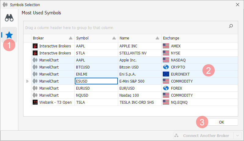
Selection of adjacent rows occurs by clicking with the mouse on the first row to be selected, either at the top or bottom, followed by a second click on the last row to be selected, but this must be done while holding down the Shift key on the keyboard. The Shift key is the key that allows you to write text in uppercase. With this operation, all the rows between the first and the last are selected.
Selecting non-adjacent rows
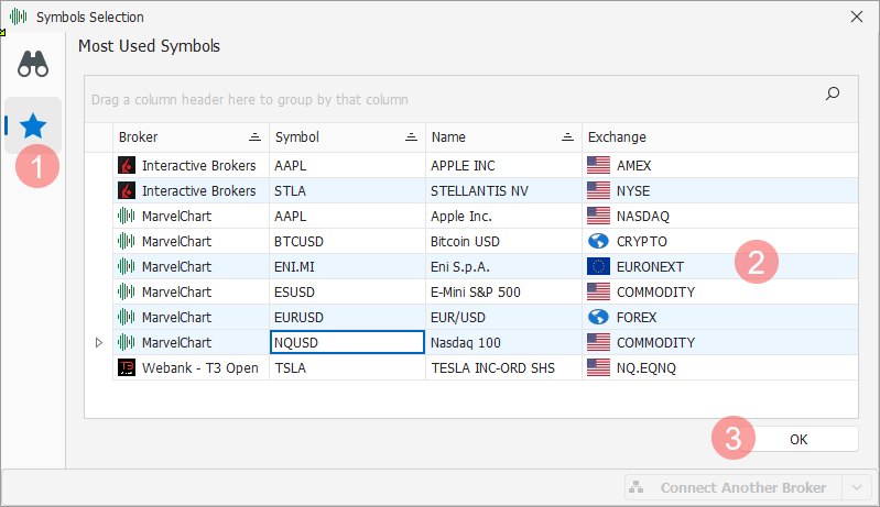
To select non-adjacent rows, you need to click the left mouse button on each row to be selected, while holding down the Ctrl key on the keyboard. With this operation, each row on which you click is selected/deselected. It is possible to combine the non-adjacent row selection mode with the adjacent row selection mode, by holding down the Ctrl + Shift keys on the keyboard.
Headers

The grid headers include three sections, the first at the top 1 consists of a panel through which it is possible to group the data of the grid, the second instead consists of the column heads 2, the third finally is represented by the automatic filters row 3. Through the headers it is possible to access the following features:
Grouping
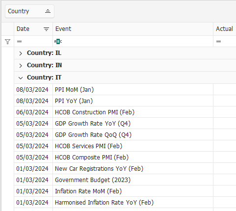
The grouping feature can be useful when there are a large number of rows on the grid. Grouping allows you to reduce the number of rows visible on the grid and navigate through the data by expanding and/or collapsing the groups on the grid. To perform the grouping, simply drag a column header with the mouse onto the grouping panel 1 located at the top. It is also possible to perform the grouping for multiple columns at the same time.
Sorting the data
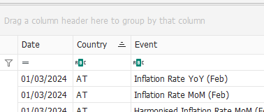
The data is sorted simply by clicking the mouse on the column header. You can sort in ascending or descending order by clicking multiple times on the same column header. To sort data in multiple columns at the same time, you must hold down the Ctrl key on the keyboard when you click on the column header. When the data is sorted in the column header, a 1 icon is visible, indicating whether the sorting is applied in ascending or descending order.
Filter on the column header
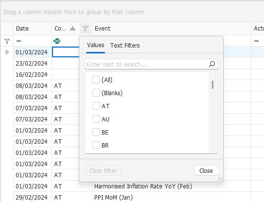
Moving the mouse cursor over the column header displays a 1 icon near the right edge, by clicking which you can set a filter on the data displayed in the grid. The filter settings window may have different characteristics depending on the type of data in the column, whether it is numeric, textual or date data.
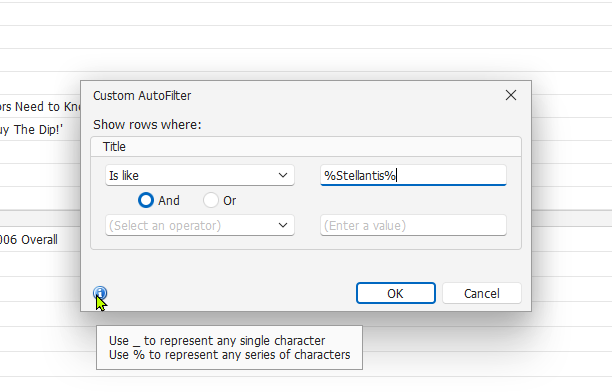
In many cases it may be useful to apply a custom filter on a column that contains text data to search for a specific word or phrase. To do this, after clicking on the icon in the column header, choose the (Custom) item. In the custom filter settings window, enter the word or phrase to search for in the first field (Enter a value), adding a % character both before and after the text to search for.
The previous image shows an example of how to search for all the rows that contain the word "Stellantis". Note how in the search field the text entered is preceded and followed by the % character, thus resulting in it being equal to %Stellantis%.
Context Menu
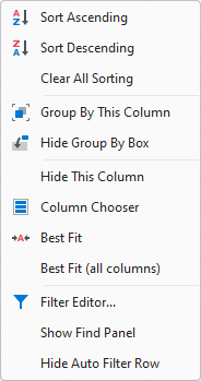
Right-clicking on a column header presents a menu that allows you to perform various actions on the grid. These operations are, as shown in the previous image, in order:
Ascending Sort of the data in the column you clicked on;
Descending Sort of the data in the column you clicked on;
Resets all sorting parameters of the grid data;
Grouping](#Grouping) the data for the column you clicked on;
Hides/Shows the grouping panel at the top of the grid;
Hide the column that was clicked;
Display the Column-Chooser to display on the grid;
Adjust the width of the column that was clicked to fit the data displayed;
Adjust the width of all columns in the grid to display more data;
Show the Filter Editor;
Show/Hide the Search Panel;
Hide/Show the AutoFilter Row.
Choosing columns to display
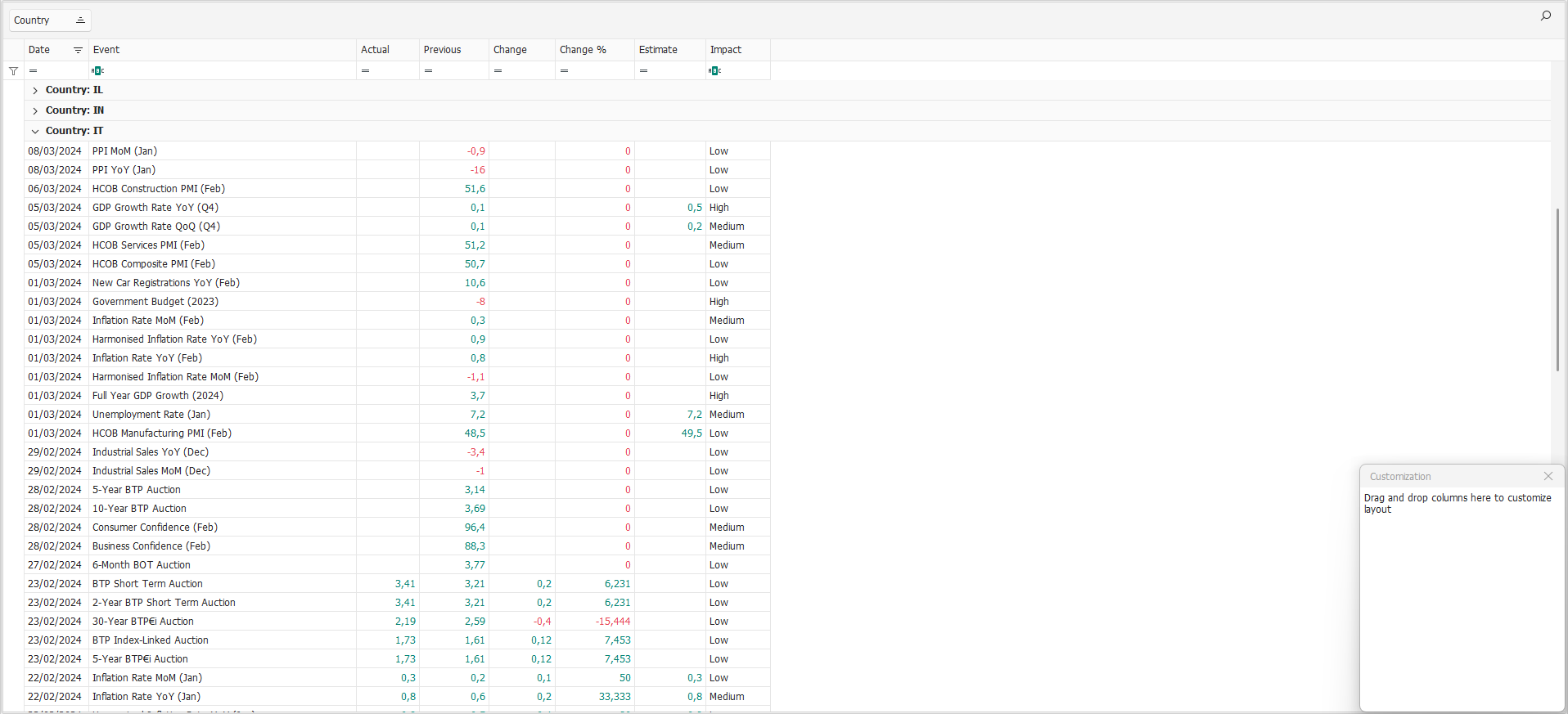
You can customize the list of columns visible on the grids by activating the appropriate feature via the context menu. When the feature is active, a 1 panel appears on the grid, listing the columns that are currently not visible. To add a non-visible column to the grid, simply drag it from the panel to the column headers row. Similarly, to hide a column, simply drag it from the column headers row to the non-visible columns panel. You can also change the position of a column in the grid by dragging its column header to the desired position within the column headers row.
Automatic filter row
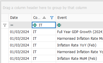
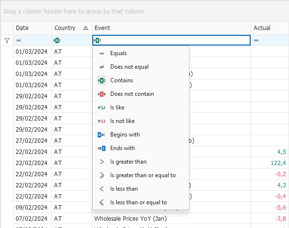
Immediately below the column headers there is a row with which you can quickly set filters on the data visible in the grid. Each column in the grid has its own filter box and it is therefore also possible to filter the data for multiple columns at the same time. On the left edge of the filter boxes there is an icon 1 by clicking which you can change the filter operation to apply to the data. The available filter operations change depending on the type of data contained in the column, numeric, text or date.
Search Panel

Using the appropriate item from the context menu you can display the search panel. Simply write the text to search for in the appropriate box 1 to display only the rows of the grid that contain the searched text, which is also highlighted.
Foot of the grids

At the foot of the grids, when filters are applied to the data, a panel is visible through which you can:
Reset all filters by clicking on the delete icon 1;
Enable/disable filters by activating or deactivating the corresponding checkbox 2;
Open the filter editor by clicking on the Edit Filter button 3.
Filter Editor
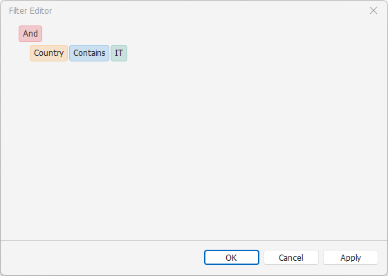
Clicking on the various filter elements presents menus through which to customize the filter characteristics, such as the column on which to apply them, the filter operation to perform, the value or values through which to filter the data.